Cell/Spot Analysis
Xenium Data Analysis
VoltRon is an end-to-end spatial omics analysis package which also supports investigating spatial points in single cell resolution. VoltRon includes essential built-in functions capable of filtering, processing and clustering as well as visualizing spatial datasets with a goal of cell type discovery and annotation.
In this use case, we analyse readouts of the experiments conducted on example tissue sections analysed by the Xenium In Situ platform. Two tissue sections of 5 \(\mu\)m thickness are derived from a single formalin-fixed, paraffin-embedded (FFPE) breast cancer tissue block. More information on the spatial datasets and the study can also be found on the bioRxiv preprint.
You can import these readouts from the 10x Genomics website (specifically, import In Situ Replicate 1/2). Alternatively, you can download a zipped collection of Xenium readouts from here.
Building VoltRon objects
VoltRon includes built-in functions for converting readouts of Xenium experiments into VoltRon objects. The importXenium function locates all readout documents under the output folder of the Xenium experiment, and forms a VoltRon object. We will import both Xenium replicates separately, and merge them after some image manipulation.
# dependencies
if(!requireNamespace("RBioFormats"))
BiocManager::install("RBioFormats")
if(!requireNamespace("arrow"))
install.packages("arrow")
if(!requireNamespace("rhdf5"))
BiocManager::install("rhdf5")
# import Xenium data
library(VoltRon)
Xen_R1 <- importXenium("Xenium_R1/outs", sample_name = "XeniumR1", import_molecules = TRUE)
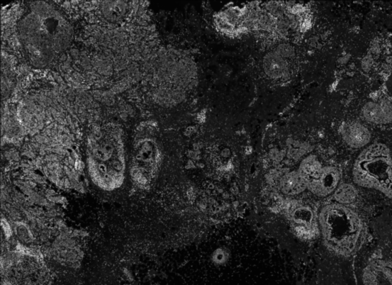
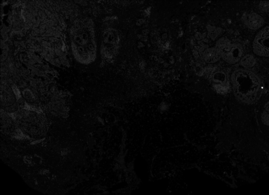
Xen_R2 <- importXenium("Xenium_R2/outs", sample_name = "XeniumR2", import_molecules = TRUE)Before moving on to the downstream analysis of the imaging-based data, we can inspect both Xenium images. We use the vrImages function to call and visualize reference images of all VoltRon objects. Observe that the DAPI image of the second Xenium replicate is dim, hence we might need to increase the brightness.
vrImages(Xen_R1)
vrImages(Xen_R2)
|
|
We can adjust the brightness of the second Xenium replicate using the modulateImage function where we can change the brightness and saturation of the reference image of this VoltRon object. This functionality is optional for VoltRon objects and should be used when images require further adjustments.
Xen_R2 <- modulateImage(Xen_R2, brightness = 800)
vrImages(Xen_R2)
Once both VoltRon objects are created and images are well-tuned, we can merge these two into a single VoltRon object.
Xen_list <- list(Xen_R1, Xen_R2)
Xen_data <- merge(Xen_list[[1]], Xen_list[-1])
VoltRon Object
XeniumR1:
Layers: Section1
XeniumR2:
Layers: Section1
Assays: Xenium(Main) Spatial Visualization
With vrSpatialPlot, we can visualize Xenium experiments in both cellular and subcellular context. Since we have not yet started analyzing raw counts of cells, we can first visualize some transcripts of interest. We first visualize mRNAs of ACTA2, a marker for smooth muscle cell actin, and TCF7, an early exhausted t cell marker. We can interactively select a subset of interest within the tissue section and visualize the localization of these transcripts. Here we subset a ductal carcinoma niche, and visualize mRNAs of ACTA2, KRT15, TACSTD2 and CEACAM6.
Xen_R1_subsetinfo <- subset(Xen_R1, interactive = TRUE)
Xen_R1_subset <- Xen_R1_subsetinfo$subsets[[1]]
vrSpatialPlot(Xen_R1_subset, assay = "Xenium_mol", group.by = "gene",
group.ids = c("ACTA2", "KRT15", "TACSTD2", "CEACAM6"), pt.size = 0.2, legend.pt.size = 5)![]()
We can also visualize count data of cells in the Xenium replicates. The behaviour of vrSpatialFeaturePlot (and most plotting functions in VoltRon) depend on the number of assays associated with the assay type (e.g. Xenium is both cell and subcellular type). Here, we have two assays, and we visualize two features, hence the resulting plot would include four panels. Prior to spatial visualization, we can normalize the counts to correct for count depth of cells by (i) dividing counts with total counts in each cell, (ii) multiply with some constant (default: 10000), and followed by (iii) log transformation of the counts.
Xen_data <- normalizeData(Xen_data, sizefactor = 1000)
vrSpatialFeaturePlot(Xen_data, features = c("ACTA2", "TCF7"), alpha = 1, pt.size = 0.7)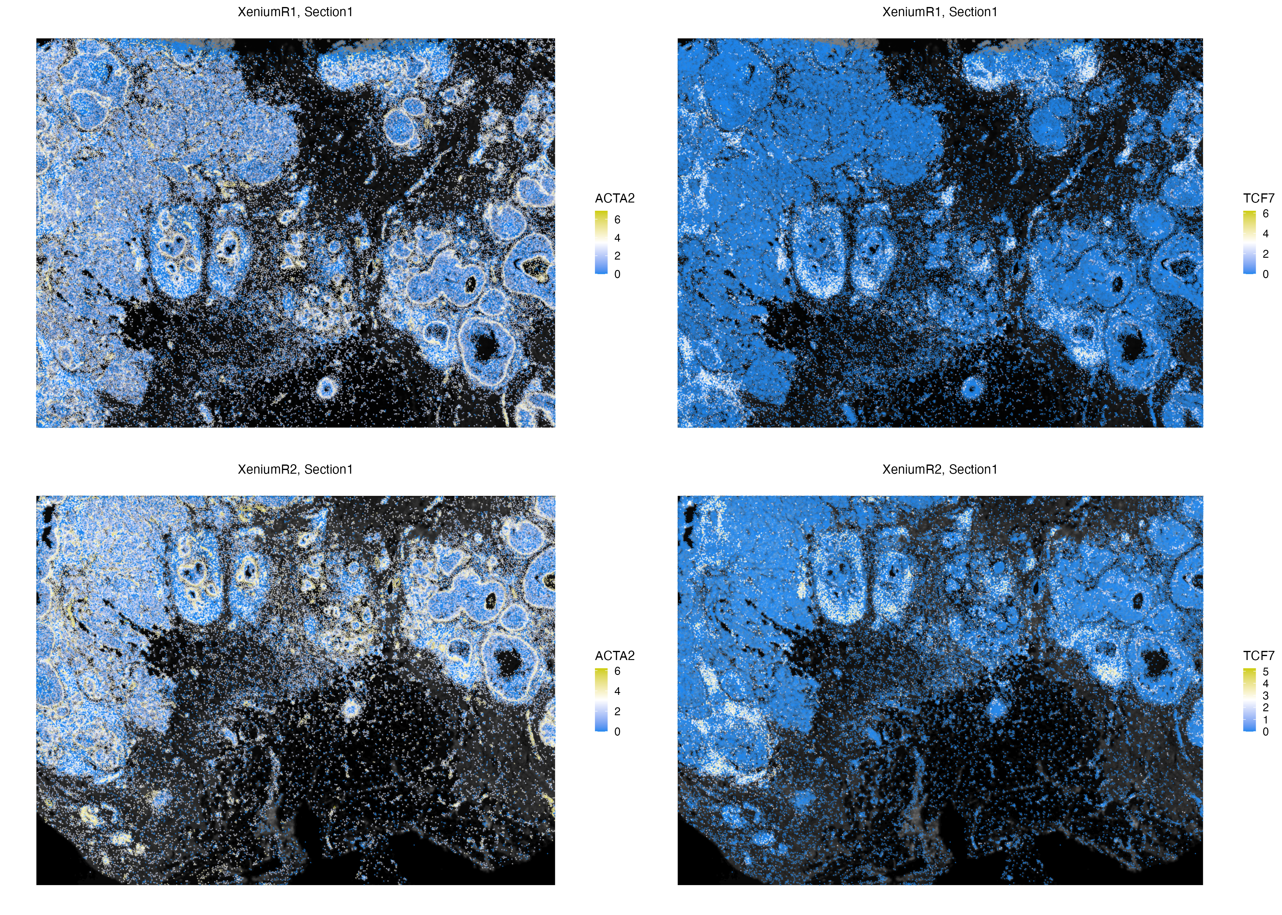
Processing and Embedding
Some number of cells in both Xenium replicates might have extremely low counts. Although cells are detected at these locations, the low total counts of cells would make it challenging for phenotyping and clustering these cells. Hence, we remove such cells from the VoltRon objects.
Xen_data <- subset(Xen_data, Count > 5)VoltRon is capable of reducing dimensionality of datasets using both PCA and UMAP which we will use to build profile-specific neighborhood graphs and partition the data into cell types.
Xen_data <- getPCA(Xen_data, dims = 20)
Xen_data <- getUMAP(Xen_data, dims = 1:20)
We can also visualize the normalized expression of these features on embedding spaces (e.g. UMAP) using vrEmbeddingFeaturePlot function.
vrEmbeddingFeaturePlot(Xen_data, features = c("LRRC15", "TCF7"), embedding = "umap",
                       pt.size = 0.4)
Clustering
Next, we build neighborhood graphs with the shared nearest neighbors (SNN) of cells which are constructed from dimensionally reduced gene expression profiles. The function getProfileNeighbors also has an option of building k-nearest neighbors (kNN) graphs.
Xen_data <- getProfileNeighbors(Xen_data, dims = 1:20, method = "SNN")
vrGraphNames(Xen_data)
[1] "SNN"We can later conduct a clustering of cells using the leiden’s method from the igraph package, which is utilized with the getClusters function.
Xen_data <- getClusters(Xen_data, resolution = 1.0, label = "Clusters", graph = "SNN")Now we can label each cell with the associated clustering index and take a look at the clustering accuracy on the embedding space, and we can also visualize these clusters on a spatial context.
vrEmbeddingPlot(Xen_data, group.by = "Clusters", embedding = "umap",
                pt.size = 0.4, label = TRUE)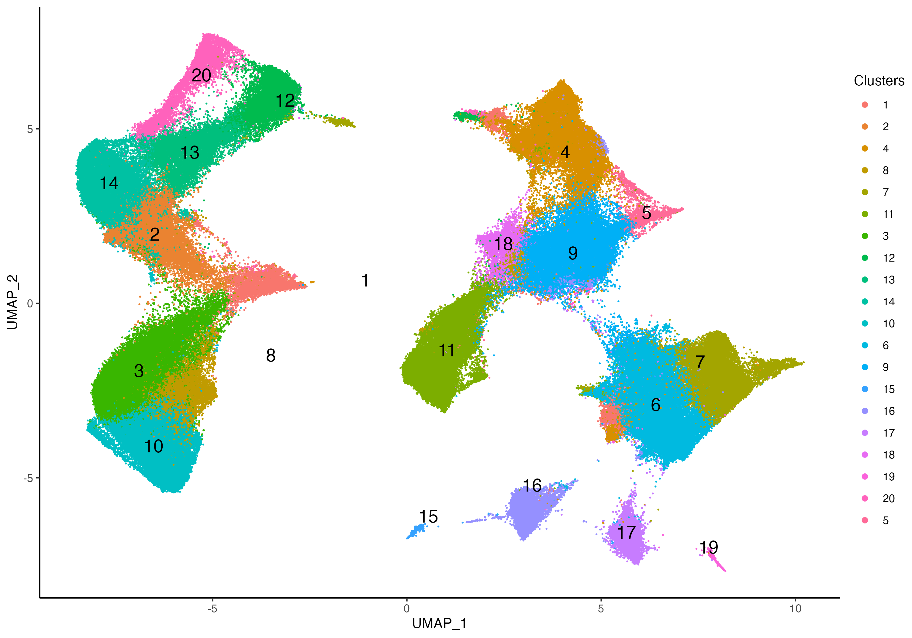
vrSpatialPlot(Xen_data, group.by = "Clusters", pt.size = 0.18, background.color = "black")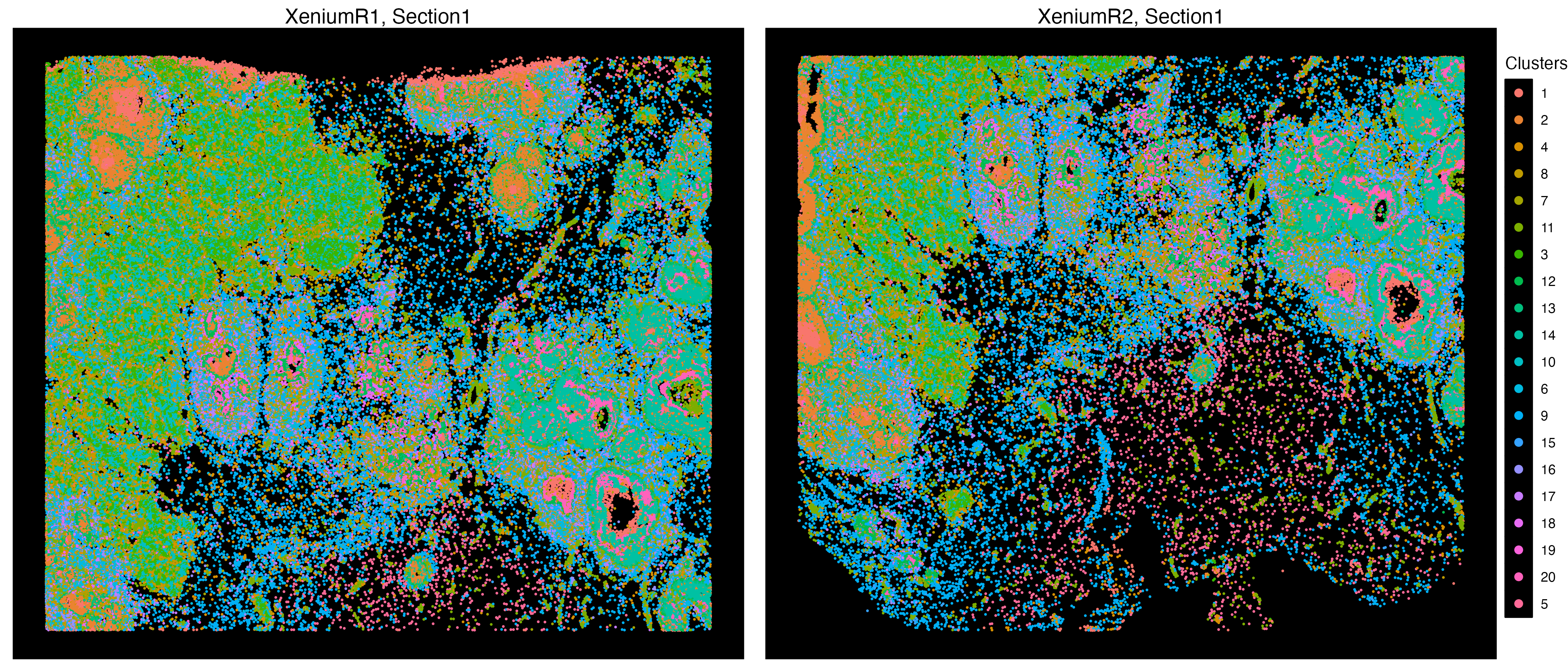
Annotation
We can annotate each of these clusters according to their positive markers across 313 features. One can use the FindAllMarkers from the Seurat package to pinpoint these markers by first utilizing the as.Seurat function first on the Xenium assays of the VoltRon object.
For more information on conversion to other packages, please visit the Converting VoltRon Objects.
Let us create a new metadata feature from the Clusters column, called CellType, we can insert this new metadata column directly to the object.
clusters <- factor(Xen_data$Clusters, levels = sort(unique(Xen_data$Clusters)))
levels(clusters) <- c("DCIS_1",
                      "DCIS_2",
                      "CD4_TCells",
                      "Adipocytes",
                      "PLD4+_LILRA4+_CD4+_Cells",
                      "ACTA2_myoepithelial",
                      "IT_2",
                      "Macrophages",
                      "MastCells",
                      "Bcells",
                      "StromalCells",
                      "CD8_TCells",
                      "CD8_TCells",
                      "EndothelialCells",
                      "StromalCells",
                      "MyelomaCells",
                      "IT_1",
                      "IT_2",
                      "ACTA2_myoepithelial",
                      "DCIS_2",
                      "IT_3",
                      "KRT15_myoepithelial")
Xen_data$CellType <- as.character(clusters)
vrSpatialPlot function can visualize multiple types of metadata columns, and users can change the location of the legends as well.
vrSpatialPlot(Xen_data, group.by = "CellType", pt.size = 0.13, background.color = "black",
              legend.loc = "top", n.tile = 500)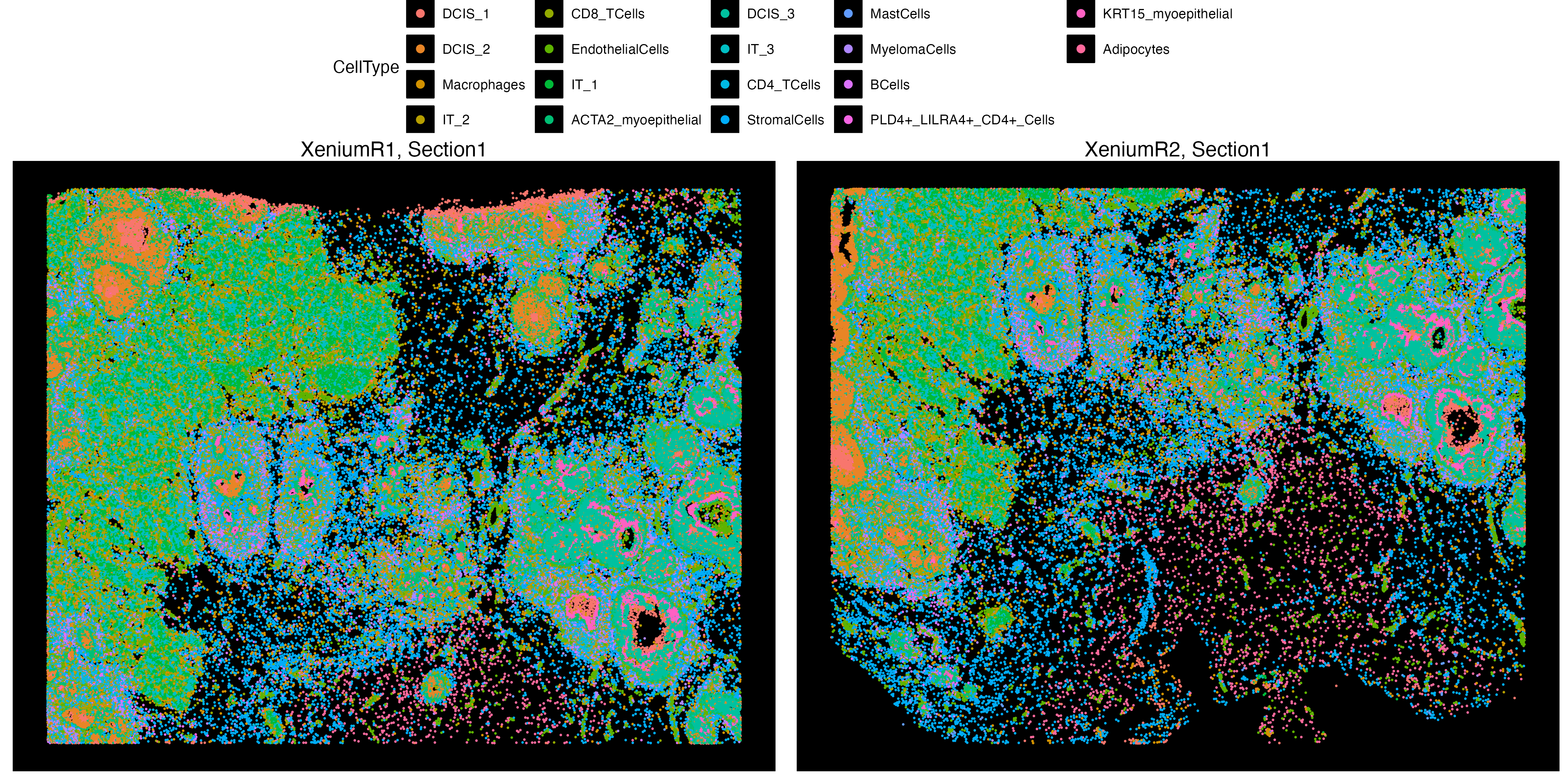
Hot Spot Analysis
VoltRon platform allows users to find hot spots (Regions of increased feature of interest) of several types of spatial entities, for spots, cells, and even molecules. Please see Molecule Analysis Tutorial for more information on hot spot analysis.
We first have to learn a spatial graph, and in the case of Xenium data which is a cell type assay we can use a Delaunay tessellation to train the neighborhood graph. This will create a second graph in the VoltRon object, representing the spatial relationship between cells.
Xen_data <- getSpatialNeighbors(Xen_data, method = "delaunay")Now, we can specify delaunay as the graph of interest, and use getHotSpotAnalysis function to test each cell and their surrounding for significant increase in a feature of interest; for example, PGR.
Xen_data <- getHotSpotAnalysis(Xen_data, graph.type = "delaunay", features = "PGR")The results of the hot spot analysis (i.e. Getis-Ord statistics, adjusted p-value and hot spot annotation) can later be found in the metadata. A hot spot here indicates a cell at the center of a cluster of cells with increased expression of PGR.
vrSpatialPlot(Xen_data, group.by = "PGR_hotspot_flag", alpha = 1,
              n.tile = 250, background.color = "black",
              colors = list(cold = "blue", hot = "orange"),
              common.legend = TRUE, legend.loc = "top")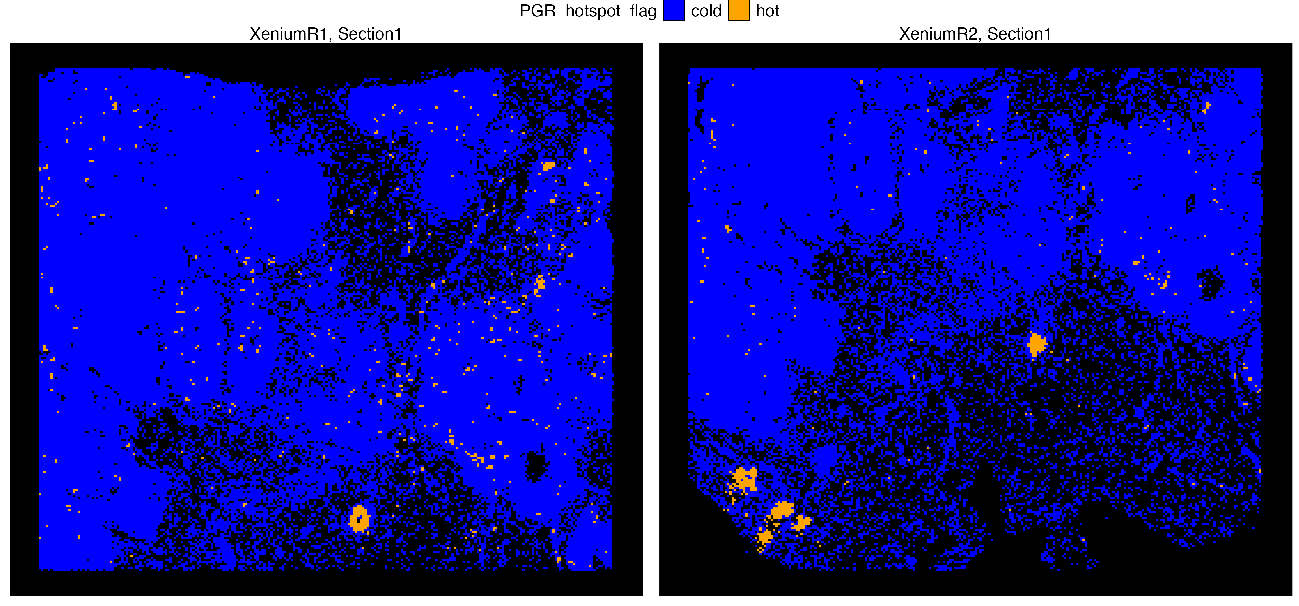
vrSpatialFeaturePlot(Xen_data, features = "PGR", alpha = 1,
                     n.tile = 250, background.color = "black")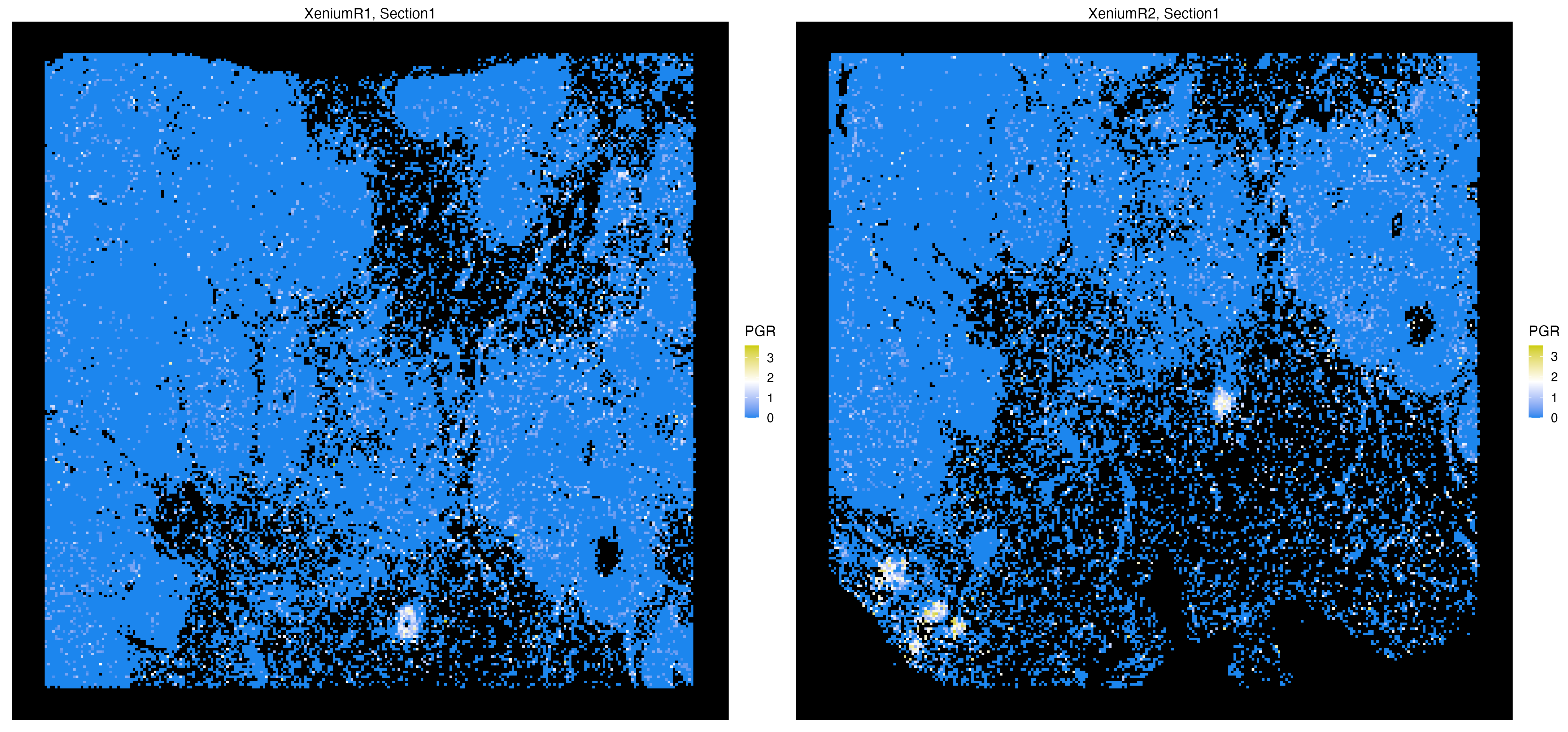
Visium Data Analysis
Spot-based spatial transcriptomics assays capture spatially-resolved gene expression profiles that are somewhat closer to single cell resolution. However, each spot still include a few number of cells that are likely from a combination of cell types within the tissue of origin. VoltRon analyzes spot level spatial data sets and even allows selecting a highly variable subset of features to cluster spots into meaningful groups of in situ spots for detecting niches of interests
Import ST Data
For this tutorial we will analyze spot-based transcriptomics assays from Mouse Brain generated by the Visium instrument.
You can find and download readouts of all four Visium sections here. The Mouse Brain Serial Section 1 datasets can be downloaded from here (specifically, please filter for Species=Mouse, AnatomicalEntity=brain, Chemistry=v1 and PipelineVersion=v1.1.0).
We will now import each of four samples separately and merge them into one VoltRon object. There are four sections in total given two serial anterior and serial posterior sections, hence we have two tissue blocks each having two layers.
# dependencies
if(!requireNamespace("rhdf5"))
  BiocManager::install("rhdf5")

# import Visium data
library(VoltRon)
Ant_Sec1 <- importVisium("Sagittal_Anterior/Section1/", sample_name = "Anterior1")
Pos_Sec1 <- importVisium("Sagittal_Posterior/Section1/", sample_name = "Posterior1")

# merge datasets
MBrain_Sec <- merge(Ant_Sec1, Pos_Sec1, samples = c("Anterior", "Posterior"))
MBrain_Sec
VoltRon Object
Anterior:
Layers: Section1
Posterior:
Layers: Section1
Assays: Visium(Main) VoltRon maps metadata features on the spatial images, multiple features can be provided for all assays/layers associated with the main assay (Visium).
vrSpatialFeaturePlot(MBrain_Sec, features = "Count", crop = TRUE, alpha = 1, ncol = 2)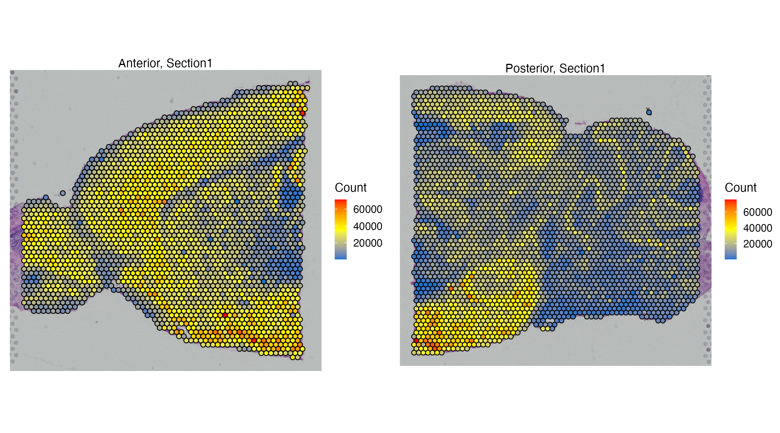
Feature Selection
VoltRon captures the nearly full transcriptome of the Visium data which then can be filtered from a list of features ranked by their variance and importance. We use the variance stabilization transformation (vst) on each individual assay using the getFeatures function and combine these ranked list to capture features important for all assay of the Visium data later with getVariableFeatures function.
head(vrFeatures(MBrain_Sec))[1] "Xkr4" "Gm1992" "Gm19938" "Gm37381" "Rp1" "Sox17" length(vrFeatures(MBrain_Sec))[1] 33502MBrain_Sec <- normalizeData(MBrain_Sec)
MBrain_Sec <- getFeatures(MBrain_Sec, n = 3000)
head(vrFeatureData(MBrain_Sec)) mean var adj_var rank
Xkr4 0.0248608534 0.0249941807 0.02800216 14114
Gm1992 0.0000000000 0.0000000000 0.00000000 0
Gm19938 0.0285714286 0.0322197476 0.03224908 13889
Gm37381 0.0000000000 0.0000000000 0.00000000 0
Rp1 0.0003710575 0.0003710575 0.00000000 0
Sox17 0.1907235622 0.2219629135 0.23715920 10304selected_features <- getVariableFeatures(MBrain_Sec)
head(selected_features, 20)[1] "Bc1" "mt-Co1" "mt-Co3" "mt-Atp6" "mt-Co2" "mt-Cytb" "mt-Nd4" "mt-Nd1" "mt-Nd2"
[2] "Fth1" "Hbb-bs" "Cst3" "Gapdh" "Tmsb4x" "Mbp" "Rplp1" "Ttr" "Ppia"
[3] "Ckb" "mt-Nd3" Embedding
Now we can learn and visualize PCA and UMAP embeddings on this smaller number of selected features
MBrain_Sec <- getPCA(MBrain_Sec, features = selected_features, dims = 30)
MBrain_Sec <- getUMAP(MBrain_Sec, dims = 1:30)
vrEmbeddingPlot(MBrain_Sec, embedding = "umap")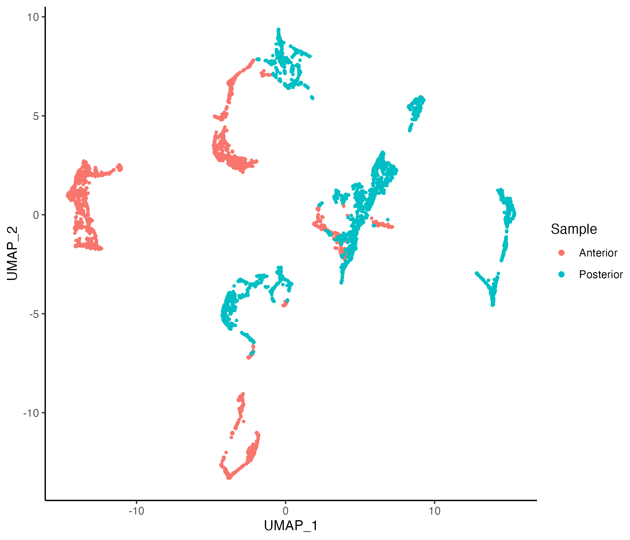
Clustering
MBrain_Sec <- getProfileNeighbors(MBrain_Sec, dims = 1:30, k = 10, method = "SNN")
vrGraphNames(MBrain_Sec)
[1] "SNN"MBrain_Sec <- getClusters(MBrain_Sec, resolution = 0.5, label = "Clusters", graph = "SNN")
vrEmbeddingPlot(MBrain_Sec, embedding = "umap", group.by = "Clusters")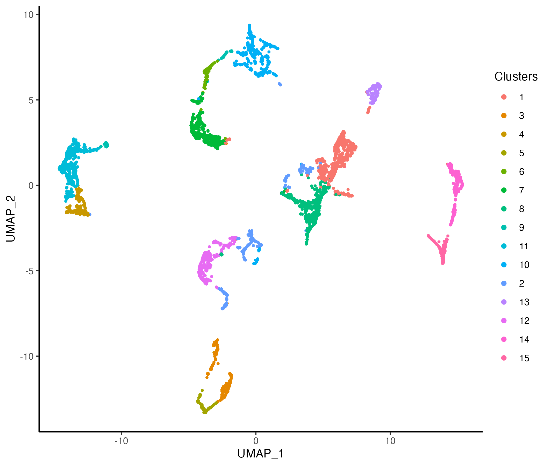
vrSpatialPlot(MBrain_Sec, group.by = "Clusters")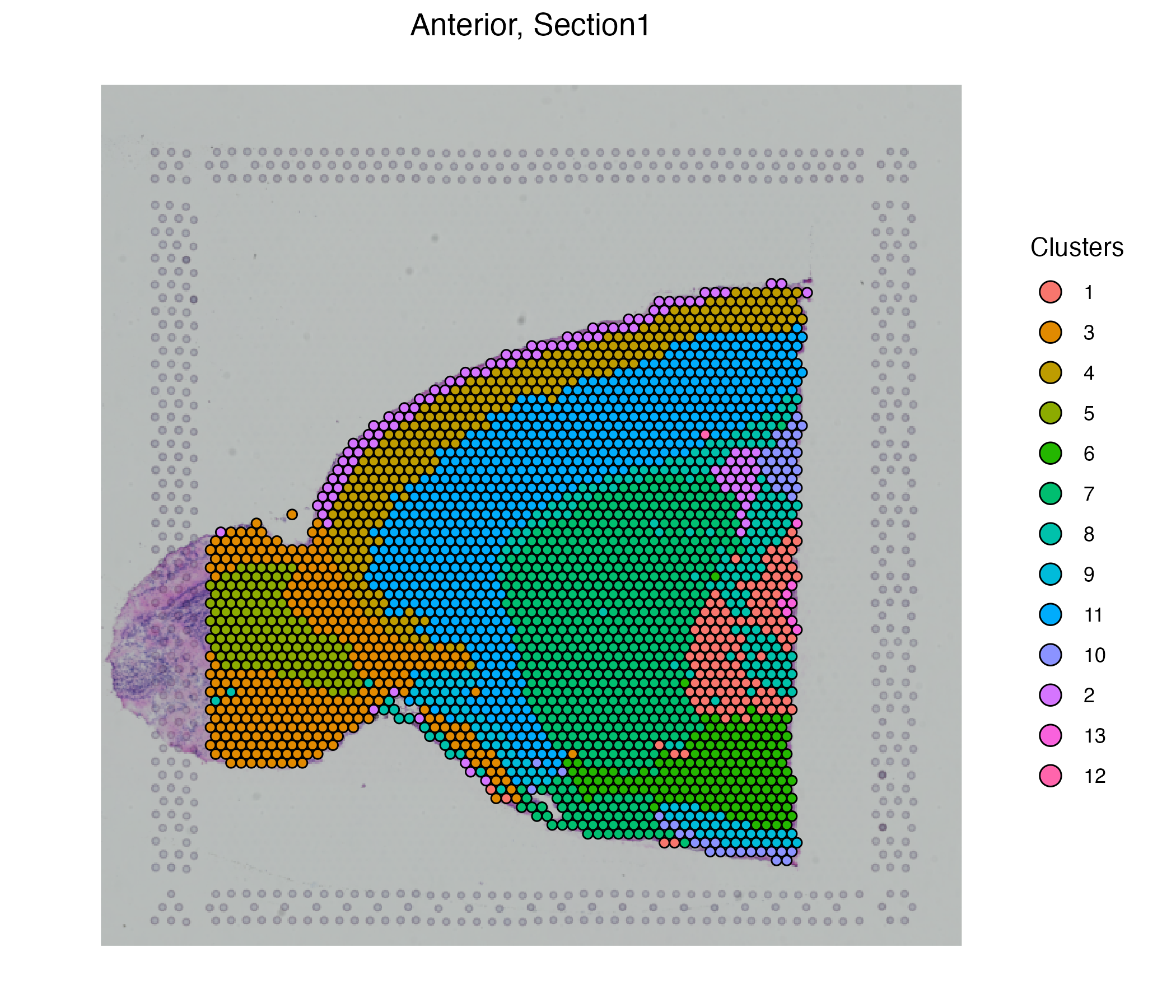
Hot Spot Analysis
VoltRon platform allows users to find hot spots (Regions of increased feature of interest) of several types of spatial entities, for spots, cells, and even molecules. Please see Molecule Analysis Tutorial for more information on hot spot analysis.
Hot Spot analysis can also be applied to spot-level dataset which might help us locate regions or niches with high values of a feature of interest, i.e. genes. We first have to learn a spatial graph where for the case of spot-level Visium data, this includes the immediate neighbors of each spot. This will create a second graph in the VoltRon object, representing the spatial relationship between each spot and the surrounding spots.
MBrain_Sec <- getSpatialNeighbors(MBrain_Sec, method = "radius")
vrGraphNames(MBrain_Sec)
[1] "SNN" "radius"Now, we can specify radius as the graph of interest, and use getHotSpotAnalysis function to test each spot for significant increase in a feature of interest, i.e. Spp1.
MBrain_Sec <- getHotSpotAnalysis(MBrain_Sec, graph.type = "radius", features = "Spp1")The results of the hot spot analysis (i.e. Getis-Ord statistics, adjusted p-value and hot spot annotation) can later be found in the metadata. We can Getis-Ord statistics of each individual spot as well as the hot and cold annotation of the spots. Each hot spot represents a niche whose Spp1 expression as well as neighboring Spp1 expressions are high.
# install patchwork package
if (!requireNamespace("patchwork", quietly = TRUE))
  install.packages("patchwork")
library(patchwork)

# visualize
g1 <- vrSpatialFeaturePlot(MBrain_Sec, features = "Spp1_hotspot_stat", ncol = 1)
g2 <- vrSpatialPlot(MBrain_Sec, group.by = "Spp1_hotspot_flag", ncol = 1)
g1 | g2 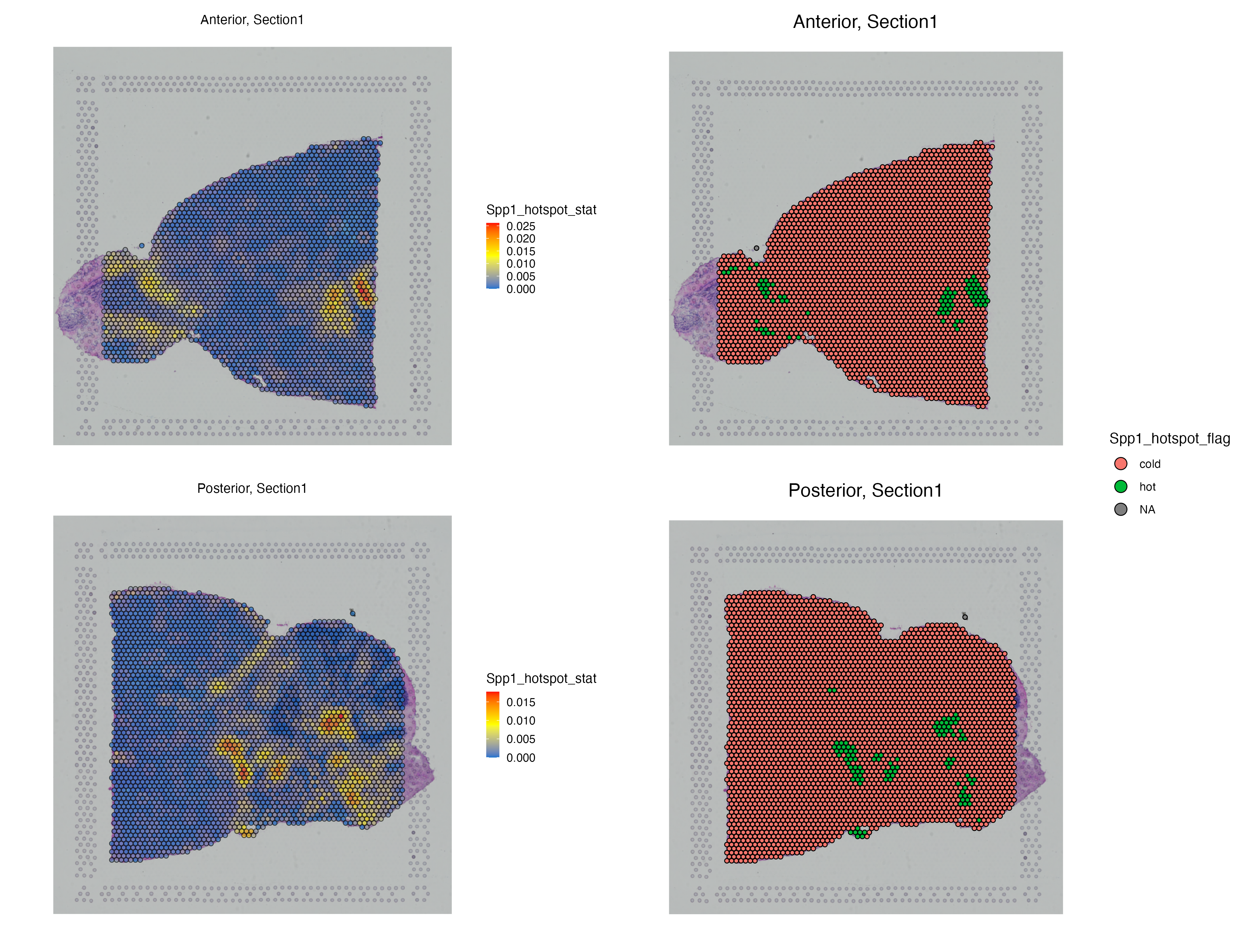
vrSpatialFeaturePlot(MBrain_Sec, features = "Spp1")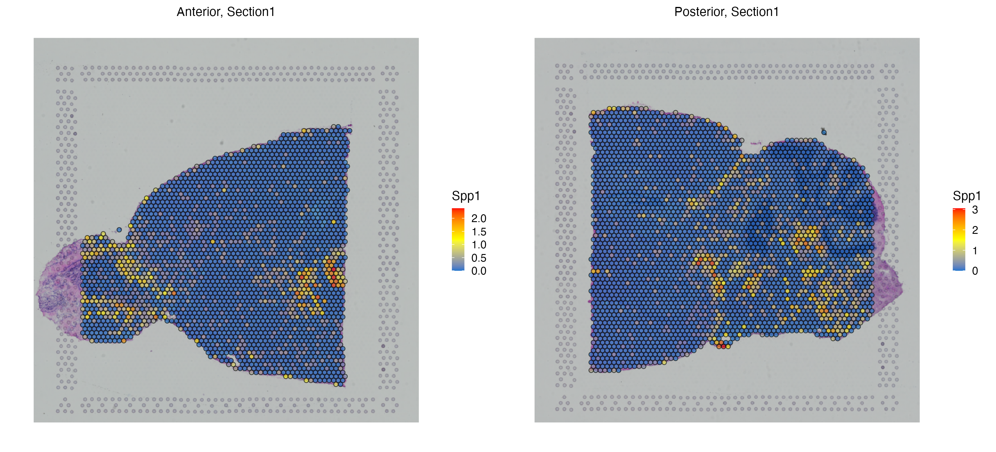
MELC Data Analysis
VoltRon also provides support for imaging based proteomics assays. In this next use case, we analyze cells characterized by multi-epitope ligand cartography (MELC) with a panel of 44 parameters. We use the already segmented cells on which expression of 43 protein features (excluding DAPI) were mapped to these cells.
We use the segmented cells over microscopy images collected from control and COVID-19 lung tissues of donors categorized based on disease durations (control, acute, chronic and prolonged). Each image is associated with one of few field of views (FOVs) from a single tissue section of a donor. See GSE190732 for more information. You can download the IFdata.csv file and the folder with the DAPI images here.
We import the protein intensities, metadata and coordinates associated with segmented cells across FOVs of samples.
library(VoltRon)
IFdata <- read.csv("IFdata.csv")
data <- IFdata[,c(2:43)]
metadata <- IFdata[,c("disease_state", "object_id", "cluster", "Clusters",
                      "SourceID", "Sample", "FOV", "Section")]
coordinates <- as.matrix(IFdata[,c("posX","posY")], rownames.force = TRUE)
Importing MELC data
Before analyzing MELC assays across FOVs, we should build a VoltRon object for each individual FOV/Section by using the formVoltron function. We then merge these sections to respective tissue blocks by defining their samples of origins. We can also define assay names, assay types and sample (i.e. block) names of these objects.
library(dplyr)
library(magick)
vr_list <- list()
sample_metadata <- metadata %>% select(Sample, FOV, Section) %>% distinct()
for(i in 1:nrow(sample_metadata)){
  vrassay <- sample_metadata[i,]
  cells <- rownames(metadata)[metadata$Section == vrassay$Section]
  image <- image_read(paste0("DAPI/", vrassay$Sample, "/DAPI_", vrassay$FOV, ".tif"))
  vr_list[[vrassay$Section]] <- formVoltRon(data = t(data[cells,]),
                                            metadata = metadata[cells,],
                                            image = image,
                                            coords = coordinates[cells,],
                                            main.assay = "MELC",
                                            assay.type = "cell",
                                            sample_name = vrassay$Section)
}
Before moving forward with merging FOVs, we should flip coordinates of cells and perhaps also then resize these images. The main reason for this coordinate flipping is that the y-axis of most digital images are of the opposite direction to the commonly used coordinate spaces.
for(i in 1:nrow(sample_metadata)){
  vrassay <- sample_metadata[i,]
  vr_list[[vrassay$Section]] <- flipCoordinates(vr_list[[vrassay$Section]])
  vr_list[[vrassay$Section]] <- resizeImage(vr_list[[vrassay$Section]], size = 600)
}
Finally, we merge these assays into one VoltRon object. The samples arguement in the merge function determines which assays are layers of a single tissue sample/block.
vr_merged <- merge(vr_list[[1]], vr_list[-1], samples = sample_metadata$Sample)
vr_merged
VoltRon Object
control_case_3:
Layers: Section1 Section2
control_case_2:
Layers: Section1 Section2
control_case_1:
Layers: Section1 Section2 Section3
acute_case_3:
Layers: Section1 Section2
acute_case_1:
Layers: Section1 Section2
...
There are 13 samples in total
Assays: MELC(Main)
Features: main(Main) The prolonged case 4 has two fields of views (FOVs). By subsetting on the sample of a prolonged case, we can visualize only these two sections, and visualize the protein expression of CD31 and Pancytokeratin which are markers of endothelial and epithelial cells.
vr_subset <- subset(vr_merged, samples = "prolonged_case_4")
g1 <- vrSpatialFeaturePlot(vr_subset, features = c("CD31", "Pancytokeratin"), alpha = 1,
                           pt.size = 0.7, background.color = "black")
Dimensionality Reduction
We can utilize dimensional reduction of the available protein markers using the getPCA and getUMAP functions, but now with relatively lower numbers of principal components which are enough to capture the information across 44 features.
vr_merged <- getPCA(vr_merged, dims = 10)
vr_merged <- getUMAP(vr_merged, dims = 1:10)
vrEmbeddingFeaturePlot(vr_merged, features = c("CD31", "Pancytokeratin"), embedding = "umap")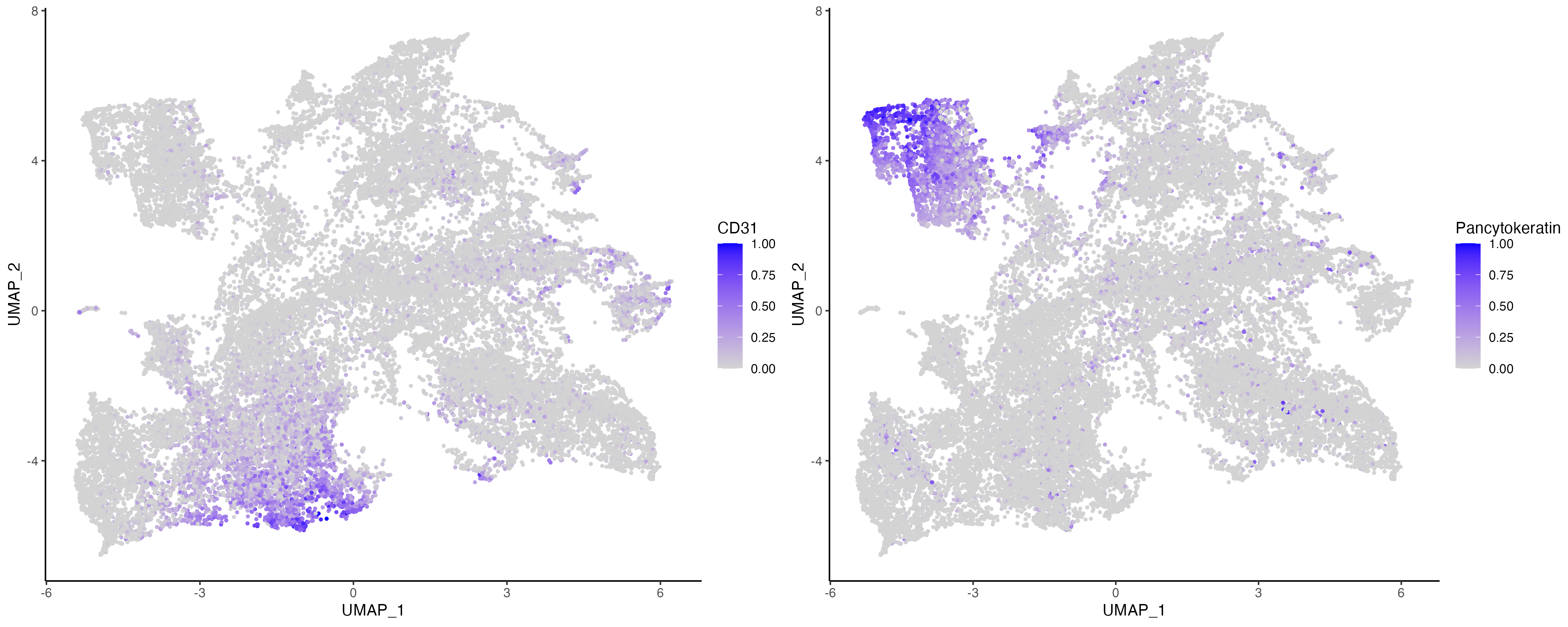
Clustering
Now we can visualize the clusters across these sections and perhaps also check for clusters that may reside in only specific disease conditions.
# SNN graph and clusters
vr_merged <- getProfileNeighbors(vr_merged, dims = 1:10, k = 10, method = "SNN")
vrGraphNames(vr_merged)
[1] "SNN"# install patchwork package
if (!requireNamespace("patchwork", quietly = TRUE))
install.packages("patchwork")
library(patchwork)
vr_merged <- getClusters(vr_merged, resolution = 0.8, label = "MELC_Clusters", graph = "SNN")
# visualize conditions and clusters
vr_merged$Condition <- gsub("_[0-9]$", "", vr_merged$Sample)
g1 <- vrEmbeddingPlot(vr_merged, group.by = c("Condition"), embedding = "umap")
g2 <- vrEmbeddingPlot(vr_merged, group.by = c("MELC_Clusters"), embedding = "umap",
label = TRUE)
g1 | g2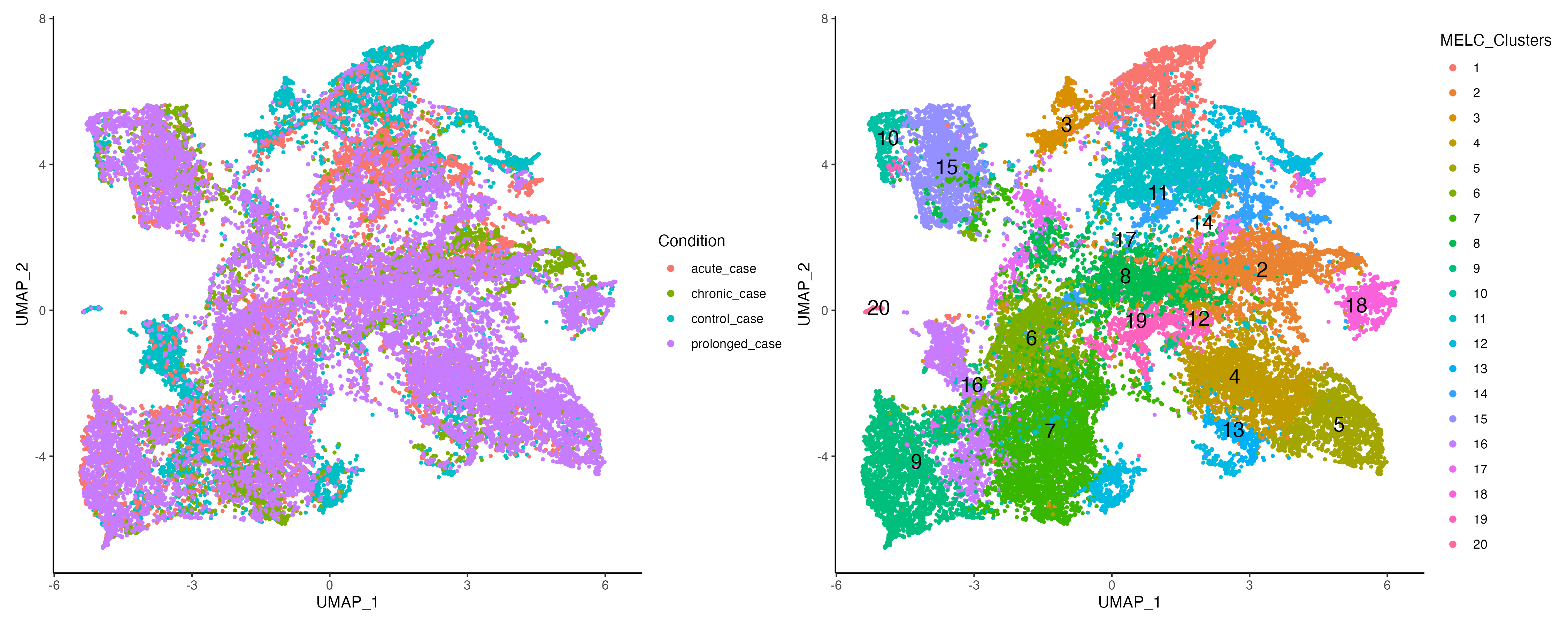
Visualization of Markers
VoltRon provides both violin plots (vrViolinPlot) and heatmaps (vrHeatmapPlot) to further investigate the enrichment of markers across newly clustered datasets. Note: the vrHeatmapPlot function would require you to have the ComplexHeatmap package in your namespace.
# install patchwork package
if (!requireNamespace("ComplexHeatmap", quietly = TRUE))
  BiocManager::install("ComplexHeatmap")
library(ComplexHeatmap)

# Visualize Markers
vrHeatmapPlot(vr_merged, features = vrFeatures(vr_merged),
              group.by = "MELC_Clusters", show_row_names = TRUE)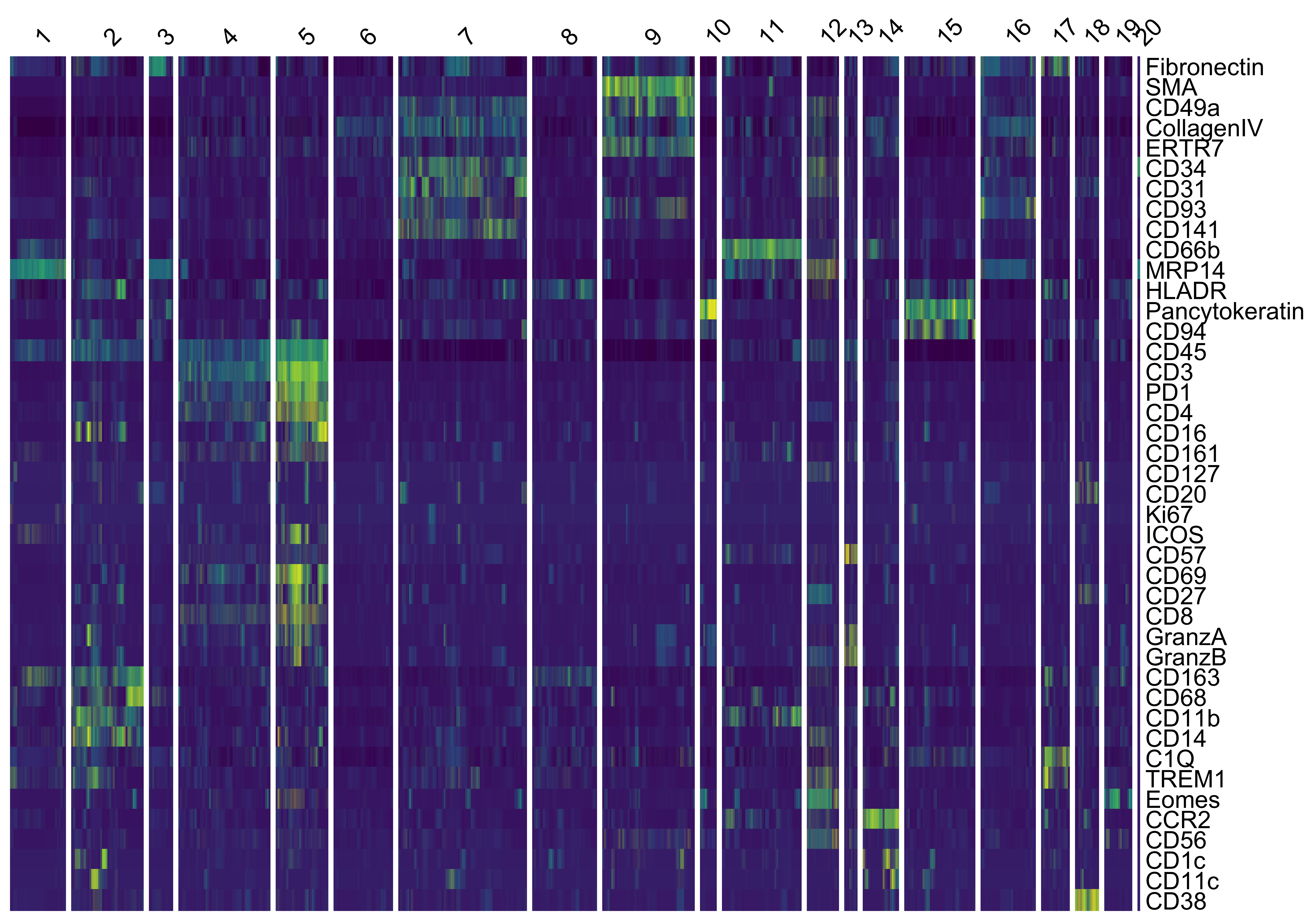
vrViolinPlot(vr_merged, features = c("CD3", "SMA", "Pancytokeratin", "CCR2"),
             group.by = "MELC_Clusters", ncol = 2)
Neighborhood Analysis
We use the vrNeighbourhoodEnrichment function to detect cell type pairs that co occur within each others’ neighborhoods. First, we establish spatial neighborhood graphs that determine the neighbors of each cell on tissue sections.
Delaunay tessellations or graphs are commonly used to determine neighbors of spatial entities. The function getSpatialNeighbors builds a delaunay graph of all assays of a certain type and detects neighbors of cells in a VoltRon object.
vr_merged <- getSpatialNeighbors(vr_merged, method = "delaunay")The graph delaunay, which we will use for spatially-aware neighborhood analysis, is now the second graph available in the VoltRon object along with SNN.
vrGraphNames(vr_merged)[1] "SNN" "delaunay"Once neighbors are founds, we can apply a permutation test that compares the number of cell type occurrences with an expected number of these occurances under multiple permutations of labels in the tissue (fixed coordinates but cells are randomly labelled). A similar approach is used to by several spatial analysis frameworks and packages (Schapiro et. al 2017, Palla et. al 2022).
Here, we will use the original cell type labels annotated by Mothes et. al 2023.
neighborhood_results <- vrNeighbourhoodEnrichment(vr_merged, group.by = "Clusters", verbose = FALSE)The neighborhood analysis provides the results of:
- the association tests (whether cell types are within each other’s neighborhood)
- the segregation tests (whether cell types are clustered separately)
between all cell type pairs across each layers and assay.
The number of each cell in a pair in each section is reported to assess the impact of the results of the test (i.e. low number of abundance in one cell type may indicate low impact).
head(neighborhood_results) from_value to_value p_assoc p_segreg value p_assoc_adj p_segreg_adj n_from n_to AssayID unique.object_subset.Sample.
1 CD163+ macs CD163+ macs 0.0000000 1.00000000 0.4304110 0.0000 1.00000000 41 41 Assay1 control_case_3
2 CD163+ macs CD4+ T cells 0.9380000 0.03300000 -0.3804436 0.9980 0.09762866 41 48 Assay1 control_case_3
3 CD163+ macs CD8+ Tcells 0.8779011 0.04339051 -0.9299209 0.9980 0.09762866 41 11 Assay1 control_case_3
4 CD163+ macs NK cells 0.8190000 0.08700000 -0.5373702 0.9980 0.15660000 41 15 Assay1 control_case_3
5 CD163+ macs endothelia 0.1230000 0.85100000 0.1155823 0.5535 0.95737500 41 139 Assay1 control_case_3
6 CD163+ macs epithelia 0.9320000 0.03600000 -0.4064646 0.9980 0.09762866 41 39 Assay1 control_case_3vrNeighbourhoodEnrichmentPlot(neighborhood_results, assay = "Assay1", type = "assoc")